Typography is an essential aspect of graphic design that can transform ordinary text into an engaging visual element. Whether you’re designing a poster, social media post, or any other visual content, the right typography can make a significant impact. PicsArt, a versatile photo editing and design tool, offers a plethora of features that make it an excellent choice for typography enthusiasts.
This comprehensive guide will walk you through everything you need to know ,how Do I Use PicsArt for Typography?, helping you create stunning text-based designs that stand out.
Introduction to PicsArt
PicsArt is a popular photo editing app available on both mobile and desktop platforms. It boasts a wide range of features, from basic photo edits to advanced design tools. With over 1 billion downloads, PicsArt is renowned for its user-friendly interface and robust functionality, making it a go-to choice for both beginners and professionals.
Why Choose PicsArt for Typography?
- Ease of Use: PicsArt’s intuitive interface allows users to quickly learn and start creating.
- Versatility: Whether you need to add simple text or create intricate typography designs, PicsArt has the tools you need.
- Accessibility: Available on both iOS and Android, as well as on desktop, making it accessible to everyone.
- Community: PicsArt boasts a vibrant community where users can share their creations and get inspiration.
2. Getting Started with PicsArt
Download and Installation
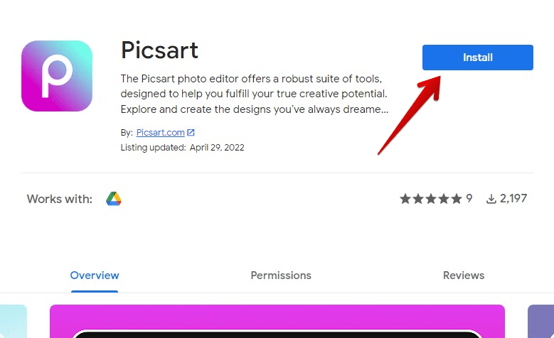
To get started with PicsArt, you’ll need to download and install the app on your device. Here’s how:
- Mobile:
- For iOS: Visit the App Store, search for “PicsArt,” and tap “Get” to download and install.
- For Android: Visit the Google Play Store, search for “PicsArt,” and tap “Install.”
- Desktop:
- Go to the PicsArt website and download the desktop version compatible with your operating system.
Creating an Account
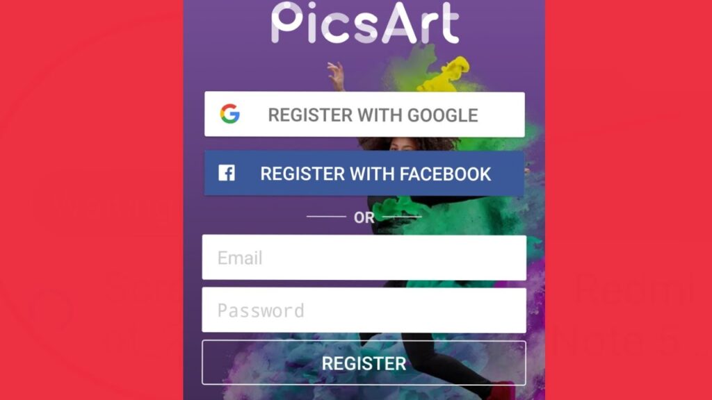
Once installed, open PicsArt and create an account. You can sign up using your email, Google account, or Facebook account. Creating an account allows you to save your projects, access premium features, and join the PicsArt community.
Exploring the Interface
Familiarize yourself with PicsArt’s interface:
- Home Screen: Access tutorials, inspirations, and your projects.
- Editor: The main workspace where you create and edit your designs.
- Tools: Various editing tools like crop, rotate, effects, text, and more.
- Layers: Manage different elements of your design.
- Export: Save and share your finished designs.
Basic Typography Tools in PicsArt
PicsArt offers a range of basic tools to get you started with typography. Let’s explore these tools and how to use them.
Adding Text
- Open a Project: Start by opening a new project or an existing image.
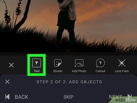
- Text Tool: Tap the “Text” icon in the toolbar.
- Type Your Text: A text box will appear where you can type your desired text.
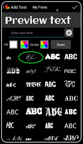
- Font Selection: PicsArt offers a wide range of fonts. Scroll through the font list to choose one that fits your design.
- Adjust Size and Position: Use your fingers (on mobile) or mouse (on desktop) to adjust the size and position of the text.
- Color: Change the text color using the color palette.
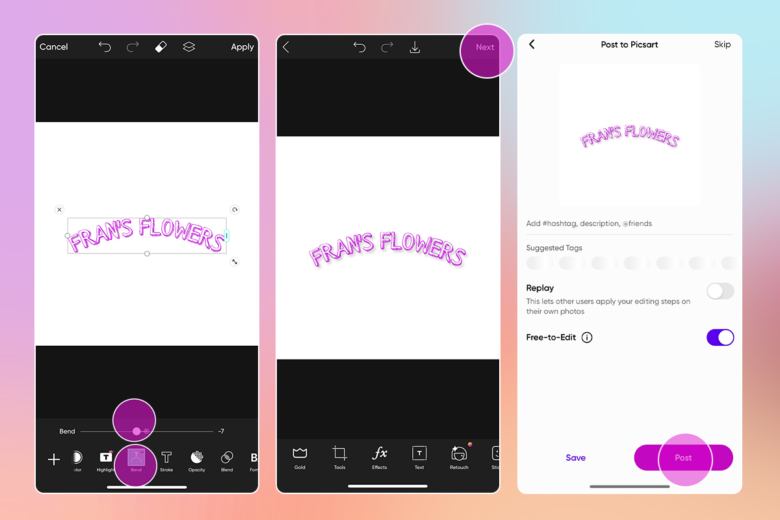
- Apply: Once satisfied, tap “Apply” to add the text to your project.
Customizing Text
PicsArt provides various customization options to enhance your typography:
- Font Style: Change the font style (bold, italic, underline).
- Spacing: Adjust letter and line spacing for better readability and style.
- Alignment: Align text to the left, center, or right.
- Opacity: Adjust the opacity to blend text with the background.
- Shadow: Add shadows to create depth.
- Outline: Outline your text to make it stand out.
Using Stickers and Shapes
Enhance your typography by incorporating stickers and shapes:
- Stickers: PicsArt offers a vast library of stickers that can complement your text.
- Shapes: Use shapes to create text backgrounds or frames.
Advanced Typography Techniques
Once you’re comfortable with the basics, it’s time to explore advanced typography techniques that can elevate your designs.
Text Effects
PicsArt offers various text effects that can add a unique touch to your typography:
- 3D Text: Create three-dimensional text for a more dynamic look.
- Gradient Text: Apply gradient colors to your text for a vibrant effect.
- Texture Fill: Fill your text with patterns or images.
- Glow: Add a glowing effect to make your text pop.
Working with Layers
Using layers in PicsArt allows for more control and flexibility in your designs:
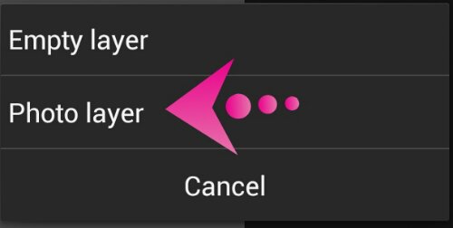
- Layer Management: Access the layers panel to manage different elements.
- Text Layers: Each text element can be on a separate layer, allowing for individual adjustments.
- Blending Modes: Experiment with blending modes to create unique effects.
- Layer Masking: Use layer masks to hide or reveal parts of your text.
Combining Images and Text
Creating a cohesive design often involves combining images and text:
- Background Images: Choose or create a background image that complements your text.
- Text Placement: Ensure the text is readable and doesn’t clash with the background.
- Image Filters: Apply filters to the background image to enhance the overall design.
Typography and Photo Manipulation
PicsArt’s photo manipulation tools can be combined with typography for stunning effects:
- Double Exposure: Blend text with images using double exposure techniques.
- Dispersion Effect: Create a dispersion effect that integrates text and images.
- Cutout Tool: Use the cutout tool to create custom shapes and text cutouts.
Tips and Tricks for Effective Typography
Creating effective typography requires more than just technical skills. Here are some tips and tricks to keep in mind:
Choose the Right Font
The font you choose sets the tone for your design. Consider the following:
- Serif vs. Sans-Serif: Serif fonts are traditional and formal, while sans-serif fonts are modern and clean.
- Readability: Ensure the font is easy to read, especially for longer text.
- Mood and Theme: Match the font style to the theme of your design.
Use Hierarchy
Hierarchy helps guide the viewer’s eye through the text. Use different font sizes, weights, and colors to establish a clear hierarchy.
Balance and Alignment
Maintain balance in your design by aligning text and images properly. Use grids and guides to help with alignment.
Consistency
Consistency in font usage, color schemes, and design elements creates a cohesive and professional look.
Contrast
Create contrast between text and background to ensure readability. Use contrasting colors, sizes, and styles.
Experiment and Iterate
Don’t be afraid to experiment with different styles and effects. Iteration is key to finding the perfect design.
Case Studies: Successful Typography Projects Using PicsArt
Case Study 1: Social Media Campaign
Objective: Create engaging social media posts for a brand campaign.
Process:
- Background: Use high-quality images relevant to the campaign.
- Font Selection: Choose bold, attention-grabbing fonts.
- Text Effects: Apply gradient and shadow effects for visual interest.
- Consistency: Maintain a consistent style across all posts.

Outcome: Increased engagement and brand recognition.
Case Study 2: Event Poster
Objective: Design a poster for a local music event.
Process:
- Background: Create a vibrant, music-themed background.
- Hierarchy: Use different font sizes and weights for event name, date, and details.
- Text Effects: Add glow and outline effects to the main text.
- Imagery: Incorporate relevant images and icons.

Outcome: Attracted more attendees to the event.
Case Study 3: Website Banner
Objective: Design a banner for a website’s homepage.
Process:
- Background: Choose a clean, professional background.
- Font Selection: Use modern, sans-serif fonts for a sleek look.
- Text Placement: Ensure the text is centered and balanced.
- Contrast: Use contrasting colors for text and background.

Outcome: Enhanced website aesthetics and user engagement.
Common Mistakes to Avoid
Even experienced designers can make mistakes. Here are some common pitfalls to watch out for:
Overcrowding
Avoid overcrowding your design with too much text or too many elements. White space is crucial for readability.
Poor Font Choices
Choosing the wrong font can ruin your design. Ensure the font matches the tone and is easy to read.
Lack of Contrast
Without sufficient contrast, text can become hard to read. Ensure there’s a clear distinction between text and background.
Ignoring Hierarchy
A lack of hierarchy can make your text confusing and difficult to navigate. Establish clear visual hierarchy.
Inconsistent Styles
Inconsistent font styles and colors can make your design look unprofessional. Maintain consistency throughout your project.
Conclusion
PicsArt is a powerful tool for
anyone looking to dive into the world of typography. With its user-friendly interface and extensive range of features, you can create stunning text-based designs that captivate and engage your audience. By mastering both basic and advanced typography techniques, and keeping in mind key design principles, you can elevate your projects to new heights. Whether you’re working on social media graphics, event posters, or any other visual content, PicsArt provides the tools you need to bring your creative vision to life.
Happy designing!
